It is a market aimed at making conscious and sustainable consumption easier for our customers, offering products that benefit both people and the environment. We achieve this by offering bulk or packaged goods that align with our philosophy: free from GMOs, sugars, preservatives, or additives — and by helping reduce the use of single-use plastics.
CONCEPT
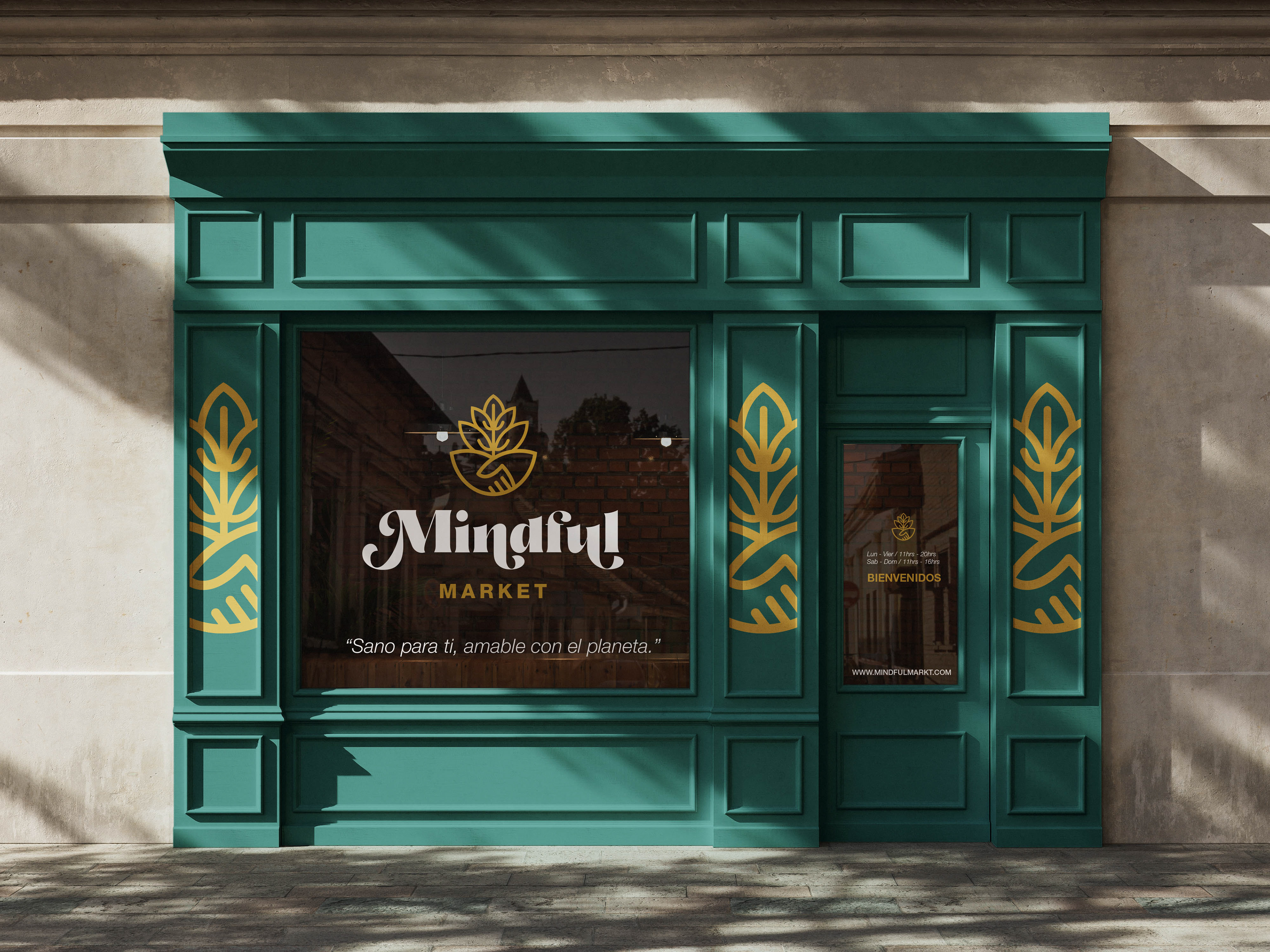
“Healthy for you, gentle on the planet.”
Mindful Market was born from a clear vision: to transform how we consume, connect, and care for our environment. We are more than just a market — we are a meeting point for those seeking balance between personal well-being and collective impact.
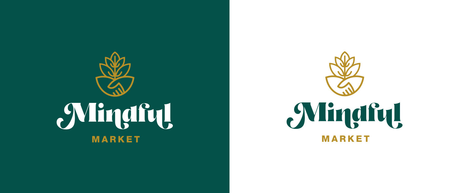
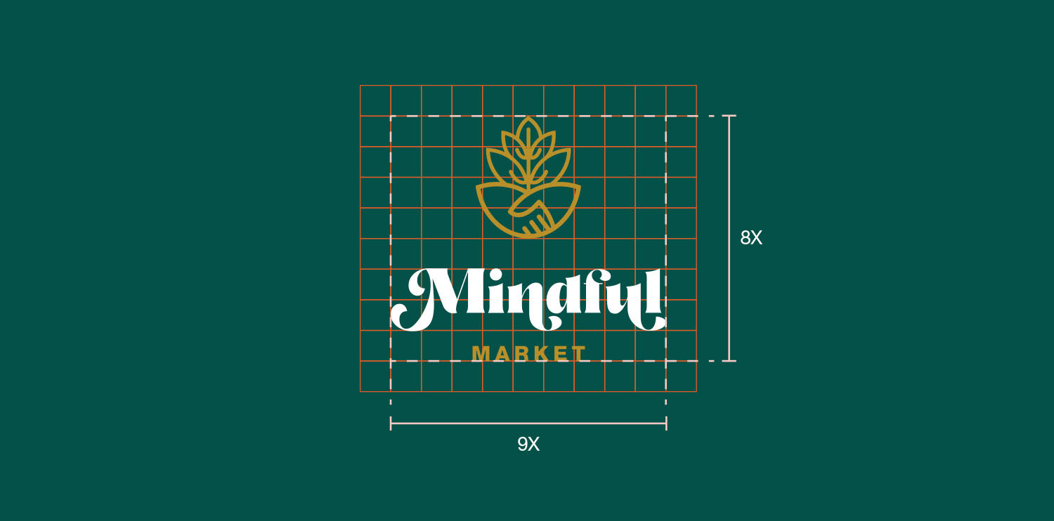
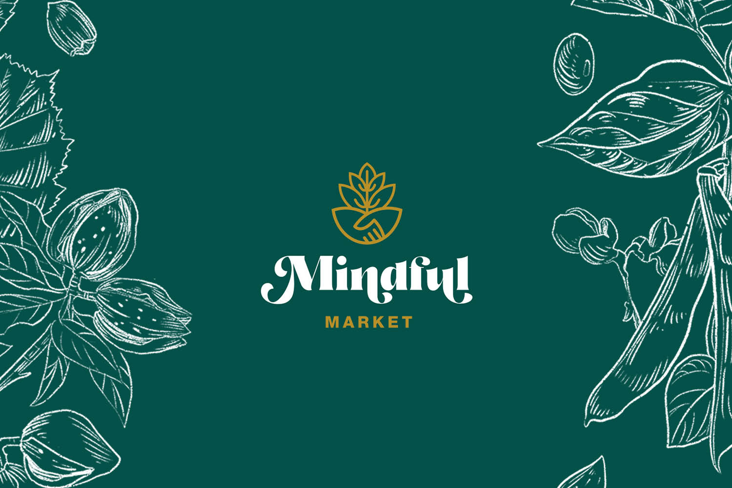
Our logo captures this philosophy:
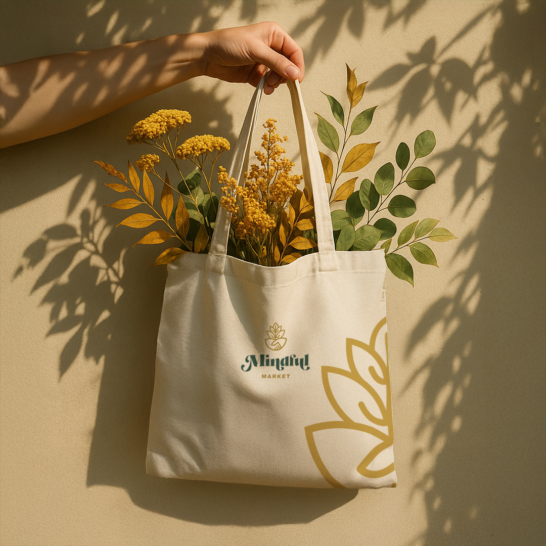
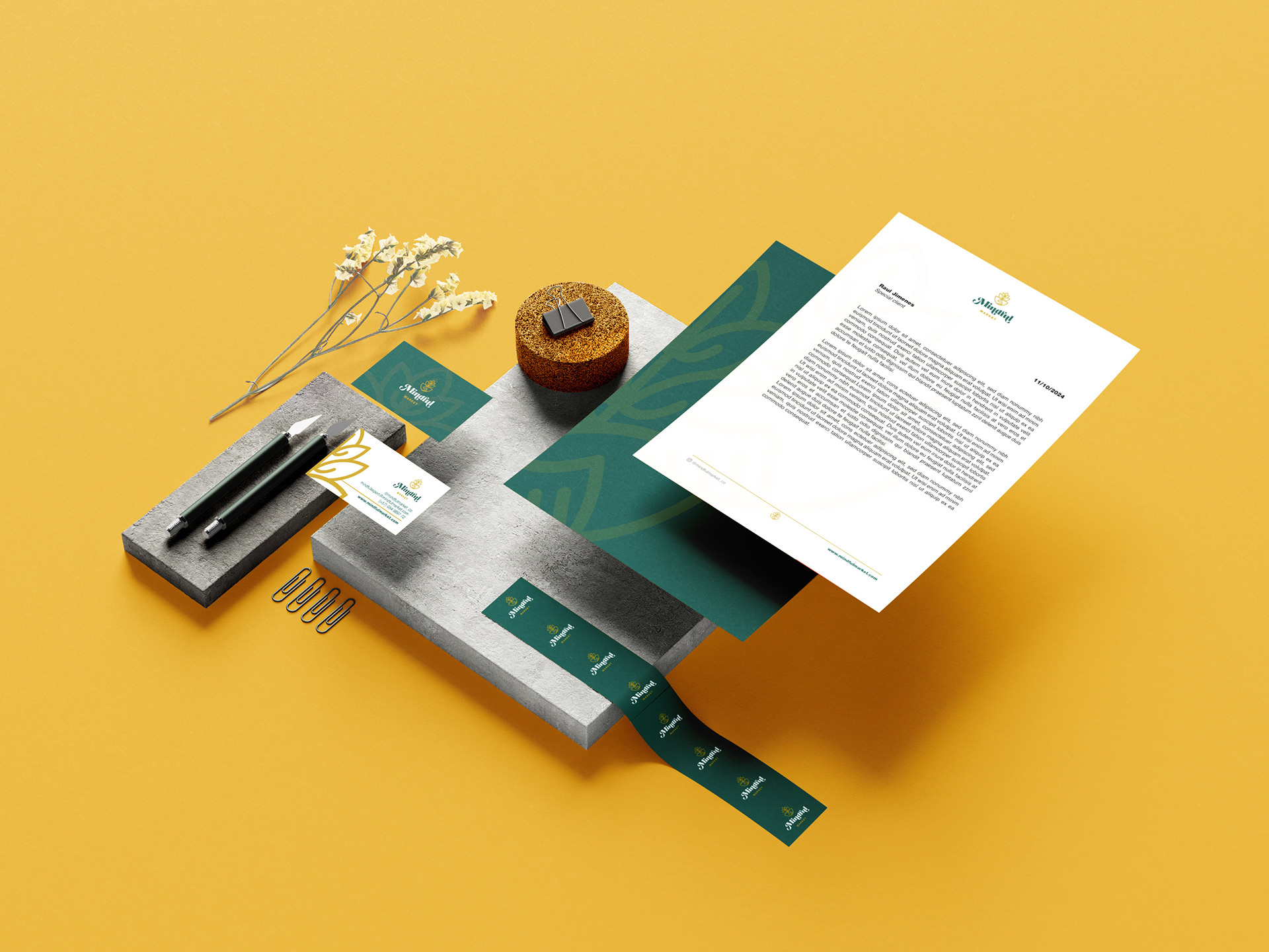
A hand — symbol of action, community, and collaboration — intertwines with a plant — symbol of life, growth, and sustainability. Together, they form a powerful yet accessible icon that represents our purpose: to cultivate a healthier, more ethical, and mindful lifestyle together.
A hand — symbol of action, community, and collaboration — intertwines with a plant — symbol of life, growth, and sustainability. Together, they form a powerful yet accessible icon that represents our purpose: to cultivate a healthier, more ethical, and mindful lifestyle together.
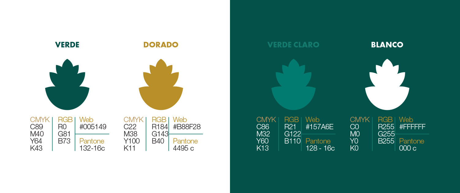
The high-contrast, generously shaped typography blends the artisanal with the contemporary. The name Mindful highlights our thoughtful and human-centered approach; Market reflects our practical, everyday purpose. The deep green and natural ochre color palette evokes the earth, the organic, and the essential.
Let me know if you'd like a shorter version for packaging or a more emotive tone for campaigns.